A 43% cost spike, traced back to a single commit
During a real cost investigation for a mid-market healthcare SaaS company, one line item on the Datadog invoice had grown 43% versus the prior period. Nobody could say why. Nothing had obviously changed — no new product launch, no headline feature, no incident anyone remembered. This is the walk-through of how that number turned into an exact date, and then an exact cause, using nothing but Datadog's own usage APIs.
Step 1 — notice the spike, at the right altitude
The starting point was estimated_cost with view=sub-org, compared month over month per product family. This is deliberately a coarse view — it won't tell you why yet, but it's the fastest way to see that something moved, and roughly how much. One product family stood out clearly against the others, which had grown normally or stayed flat.
Step 2 — break it down by product family
With the affected product family identified, the next step was usage/hourly_usage filtered to that family specifically. This is where the coarse monthly number turns into a usage-volume trend you can actually inspect — because estimated_cost tells you what you were billed, but hourly_usage tells you what actually happened, day by day, which is the only way to find a moment in time rather than just a monthly delta.
Step 3 — walk day by day until the line breaks
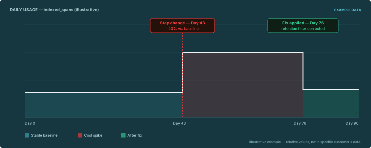
This is the part that takes patience, not cleverness: pulling day-by-day usage history and looking for the specific pattern of a long, stable baseline followed by a step-change on one exact day — not a gradual ramp, a step. Gradual growth points to organic scaling; a step points to something that shipped. In this case, the data showed exactly that shape: usage sat flat for weeks, then jumped to a new, equally-flat, higher baseline starting on one specific date.
Once you have the exact day, the number stops being abstract. "Our bill grew 43%" is hard to act on. "Usage stepped up on this specific date" is one calendar lookup away from an answer.
Step 4 — the date lines up with a deploy
The step-change date landed exactly on the day of a feature rollout — a deploy that changed instrumentation behavior (more services reporting, or tracing configured differently for a newly-shipped component) in a way that increased the relevant usage dimension going forward, permanently, not as a one-time blip. Once the date was known, correlating it against the deploy history was fast — because at that point you're not searching for a needle in a haystack, you're checking whether anything shipped on one particular Tuesday.
The generalizable lesson
Cost spikes are dates, not just numbers. A percentage on an invoice tells you something is wrong; it doesn't tell you what or when. The exact day is the piece of information that turns a cost investigation into a five-minute git-log lookup instead of an open-ended audit of "everything that might have changed sometime in the last quarter." Everything upstream of that date — the coarse detection, the product-family breakdown, the day-by-day walk — is mechanical and repeatable. Finding the date is the hard, valuable part. Matching the date to the actual commit is comparatively easy, once you know which day to look at.
Worth being explicit about scope: that last step — correlating a usage step-change date against your own git history — is deliberately not automated in v1 of this kind of tool. Repo access is a meaningfully bigger ask than read-only Datadog API access, and it's a strong candidate for a later iteration. In v1, the tool gets you the date and the product family; connecting that date to your own deploy history is still a manual, final step.
DDCostControl automates steps 1–3 of this exact method — spike detection, product-family breakdown, and day-by-day step-change detection — against your own Datadog org, self-hosted. It hands you the date; your own git log gets you the rest.
Email us — arena@wagoe.com